Color Theory
Why is Color Important?
One of the best examples of poor color choices is the use of the very common ‘jet’ color map.

Just presented as a color bar it may be hard to recognize, but most will be familiar with it as the red and blue color scheme from weather reports, still in use as of 2020:


It is even used in medical imaging, such as the imaging of arteries below:
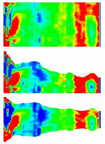
The appeal of this color map is that it appears at a glance to offer a lot of contrast and it has historically been in common use. However, this color palette actually distorts data because there are too many peaks of brightness, it lacks a sense of uniformity and is also unfriendly towards various forms of color blindness.
In other words: You can kill people by making incorrect color choices. choosing the wrong colors can lead to technical errors, potentially costing lives, or less sales, potentially costing the business.
Making Better Color Choices
Making better color choices in part depends on your data.
Sequential Data
Viridis
Inferno
Diverging
Cyclic
Qualitative
Advanced
Color theory as a subject matter can be as advanced as you might like, as there is a lot of room for optimization. One great example of this is the development of the Viridis colour scheme.
Reference
https://matplotlib.org/3.1.0/tutorials/colors/colormaps.html
https://99designs.com.au/blog/tips/the-7-step-guide-to-understanding-color-theory/
https://jakevdp.github.io/blog/2014/10/16/how-bad-is-your-colormap/
https://www.youtube.com/watch?v=xAoljeRJ3lU
http://iis.seas.harvard.edu/papers/2011/borkin11-infoviz.pdf
https://ai.googleblog.com/2019/08/turbo-improved-rainbow-colormap-for.html